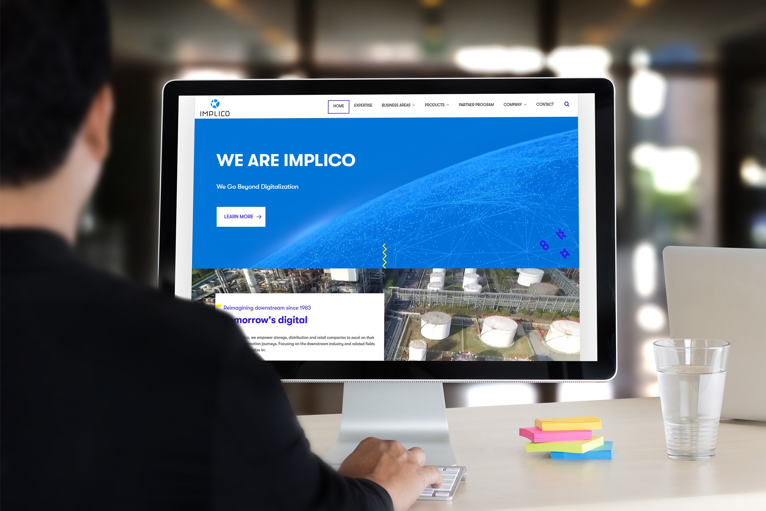
German downstream IT specialist Implico Group has unveiled new branding, with a new logo, new colours and a brand new, rebuilt website.
The new website has been designed to be lean, structured, and easy to navigate. It also offers lots of options to contact Implico. The new company logo features the iconic Implico synapse in reimagined form and is in two shades of blue to convey future-readiness and tech-savviness. The yellow highlights stand for the spark of ingenuity that distinguishes Implico’s solutions and services.
 ‘We are blessed to look back at a successful history of close to 40 years. Yet, we are also keen to look forward into a promising future. With innovative cloud solutions like QINO vNext and Supply Chain United we empower our customers to make their businesses fit for tomorrow and go beyond digitalisation. The way we appear on the market now is perfectly in line with the competencies that define Implico in 2021: Innovation. Agility. Thought leadership,’ says CEO Tim Hoffmeister.
Implico’s head of sales and marketing, Thomas Roller adds: ‘The new look and feel is a direct product of Implico’s innovative DNA. It fully embodies who we are, what we stand for and what we offer. We assigned a cross-department team with this task and they did a stellar job.’
AS well as the cloud-based terminal management system QINO vNext and the cloud component platform Supply Chain United, the Implico Group offers terminal management system OpenTAS, data communication service iGOS and the official SAP solutions for secondary distribution and fuels retailing, SAP S/4HANA SDM and SAP S/4HANA RFNO.
